I have been going through some pictures I took (well, had taken) of my NL beer bottle collection and I noticed that I had a great lineage of Blue Star bottles. So, why not take a look at how they’ve changed over the years?
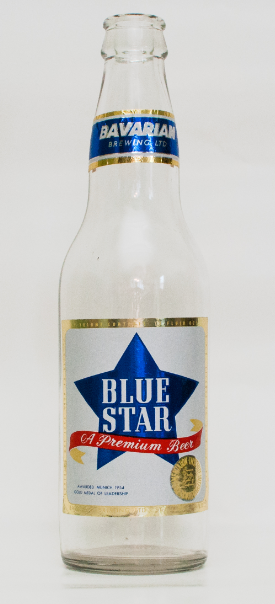
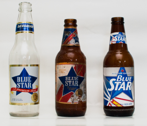
The oldest one I have is from the 1960s:
It’s a heavy bottomed glass bottle (thicker than today’s vintage, unless you drink Steamwhistle) with a shiny gold label. It’s the same label I have over on the overview, but this one is still attached to the bottle, which is a plus! It’s still from the Bavarian Brewing era, so it’s likely from sometime prior to, or just slightly after, 1962.
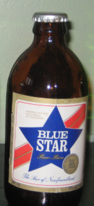
This bottle is likely from the 1970s, the era of the stubby. The label hasn’t changed too much, but the red strip has moved into the background and the tag line “The Star of Newfoundland” has been added. It still has the iconic “Gold Medal of Leadership” from Munich in 1954 which is now, as it was then, a pretty cheesy thing to put on a beer bottle.
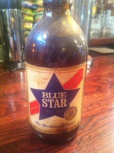
In a longer post I discussed this Blue Star bottle, still full of beer, that’s at the Duke of Duckworth in St. John’s. I dated it from the early 1980s, near the end of the stubby era, because it was kept at the bar (I figured they kept it as a novelty once stubbys became more rare). My dating here is guesswork, so I’m not sure when the phrase “The Sportsman’s Friend” came into use. Was “The Star of Newfoundland” first, or was it “The Sportsman’s Friend?” Right now, I’m not sure. I sure do wish I had a copy that said “The Sportsman’s Friend” though!
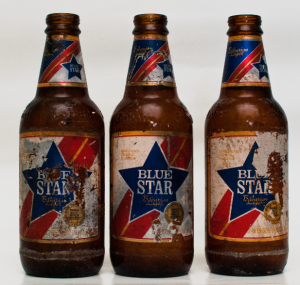
Continuing into the 1980s we see that Blue Star, out of the stubby phase, is now into more common looking Newfoundland short necks. These are embossed with “Labatt” and were found in a shed in New Chelsea in the Summer of 2012 (thanks to Keith Cooke!). They’re in rough shape, but they show the same kind of label design as before, with the red strip and the bright blue star. They do look very 80s though, don’t they?
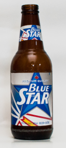
Which brings us to today. The 2012 version of the bottle, which uses a design from the early 1990s, has the red stripe from the background transformed into Christopher Pratt’s Newfoundland provincial flag. The gold border has been replaced with the gold of the arrow in the flag (pointing to a “brighter future“) and the star has received some stylistic shading.
There is an interesting study on the rebranding of Blue Star in the early nineties which states that:
At that time, there was only one other product that had positioned itself as an indigenous brand of beer and that was Molson’s Black Horse. Its advertising focused on young beer drinkers and their lifestyles as students, partygoers, nightlife enthusiasts and so on – it was the Molson Canadian of Newfoundland. It should be noted that while Black Horse was known to be local in origin, the advertising was seen by many to be an imitation of mainstream North American beer advertising. As a result, this gave Labatt an opportunity to reposition Blue Star as the true local brew, with a positioning statement for Blue Star best expressed as: ‘Blue Star is the ultimate Newfoundland beer, for Newfoundlanders, by Newfoundlanders’.
Employing advertising firm Vaughn Whelan & Partners Advertising Inc,
Blue Star was positioned as ‘The Shining Star Of The Granite Planet’, a copy line that embraces the beers’ quality, its local origins, and stresses the ironic sense of humour. Tactically, we wanted to be as different from Black Horse as possible: humour versus music, radio versus TV, local versus mainland imagery. Creatively, the radio spots played up the local sense of humour and downplayed the beverage qualities. The commercials had the tag line ‘Blue Star, The Shining Star Of The Granite Planet’.
They conclude:
Together, Blue Star and Blue Star Glacier Cold are now slowly but surely chipping away at Molson’s dominance in Newfoundland’s young adult market, while spending only a fraction of what the competition does, and not cannibalizing other Labatt brands.
Blue Star Glacier Cold? It was one of those “ice” early-90s fad beers. What did it look like? This website has an image, but, from what I understand, it was a short lived product (really, any beer advertising itself as pasteurized has lost my confidence).
That brings us through the aesthetic changes to Blue Star over the last 50 years. Did the taste change? Did the quality? Those are much harder questions to answer. A diehard Blue Star drinker might not notice subtle changes over many years, while other might just say it always wasn’t very good (non-Blue Star drinkers, obviously). That’s the tricky thing about beer history, it’s a temporary product which leaves little trace. Even bottles rarely survive. Remember to enjoy the beers you enjoy now, for who knows how history will treat them.
Bonus! From youtube user lambchops71, a radio add from the early 1990s “shining star” series.

I think I have an older label for Blue Star I an email a pic if you want it,
Dave, I’d love that! Please send it along!